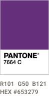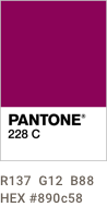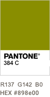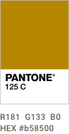
The Newell Brands color system reflects our rich, dynamic, multi-dimensional corporation, and transcends individual brands while still being flexible enough to work with already established product color systems. Recommended is one dominant color and one or two accent colors.
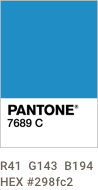
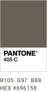
PANTONE 7689 (Blue) and PANTONE 405 (Gray)
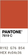
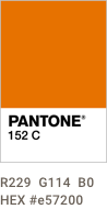
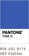
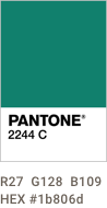
Use these colors when more colors are required or to designate business segments. Colors are typically used at 100%. Use tints and screens sparingly.
Colors vary greatly in printed and digital applications. Colors displayed on this page follow Web Content Accessibility Guidelines (WCAG) and were selected specifically to be legible for various color perceptions.
We recommend color tests prior to final printing because printing equipment varies. Work with your printer to match CMYK builds to the PANTONE coated swatch, even on uncoated stocks.
Color is for reference only. Please use actual PANTONE color swatches for accurate color matching.