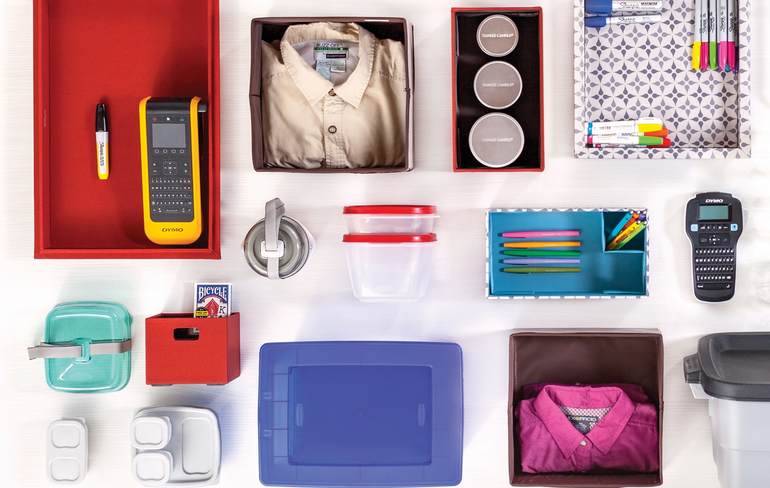
Newell Brands is a winning combination of Newell Rubbermaid and Jarden Corporation, two of the world’s most successful consumer products companies.
Together we are Newell Brands and we are better together.
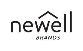
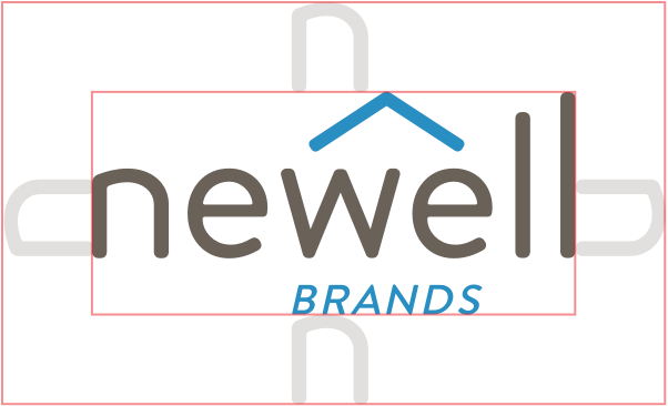
The Newell Brands corporate mark is the most immediate representation of our company, our people, and our brand to the world. It is a valuable corporate asset, the symbol of what we stand for: partnership, momentum, growth and a heritage built on innovation.
The primary use of the Newell Brands mark should be the two-color version. In most instances, visual communications coming from Newell Brands should use the two-color logo on a white background only.
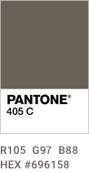
In cases where the two-color logo is not appropriate, the one-color versions represented here are acceptable (Black and PANTONE 405).
limited use: black
limited use: PANTONE 405
When the mark appears on a dark background or on a photograph it should appear in white.
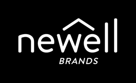
secondary use: on black
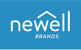
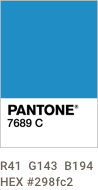
secondary use: on PANTONE 7689
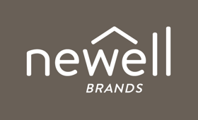
secondary use: on PANTONE 405
secondary use: on photograph
Our mark should always be surrounded by a clear space so that it is never crowded by other elements. The distance is determined by the visual height of the Newell “n” as shown in the illustration.
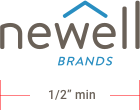
The mark should never be smaller than 1/2” wide.
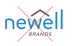
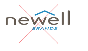
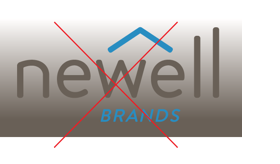
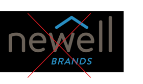
The Newell Brands mark should not be altered in any way.
Do not change colors, rotate, squeeze, skew, apply any effects to the mark, or change the font, size, or proportions.
do not change color combination
do not outline
do not move elements
do not add graphic elements
do not use any other color
do not stretch
do not alter the relationship of elements
do not place two-color logo on color background (improper clear space)
The Newell Brands mark should be positioned in the corner with proper clear space.

Newell Brands is a sign-off (hyphenated) for external communications. The mark position is in the lower left to elevate the imagery and content. (PowerPoint, Keynote, internal newsletters, etc.)

The upper left corner is for instances when the brand is the priority element on the corporate organizational materials (Corporate stationary system).

The bottom right is preferred placement for communications from internal groups or programs. (Learning & Development, ERG's, etc.)

The upper right position is preferred placement for promotional materials. (Events, special announcements, etc.)
