
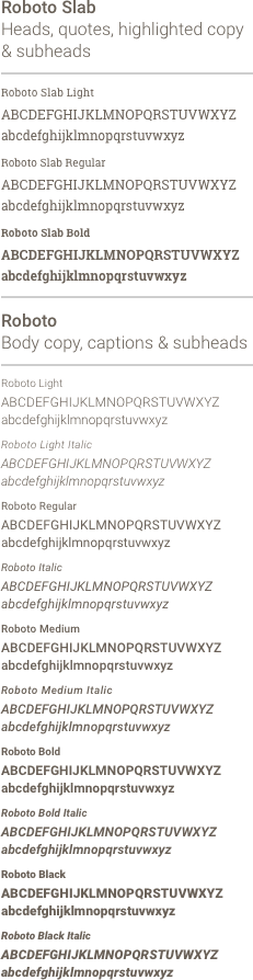
Roboto and Roboto Slab are the Newell Brands fonts. Download the Newell Brands fonts.
Not all weights are acceptable. The fonts below have been pre-selected.
The Newell Brands name should always appear in initial caps in headlines and body copy.

Names of departments, functions and segments should always have initial caps when referenced in copy.

When the possessive is used it should always appear as Newell Brands’.

For all headings, subheads and in body copy, use sentence structure (initial cap).

When the program or function name is used with the mark, the name should be all lower case with the distance of the "we" in Newell Brands.
The size of the type should have the same height as the 'w' in the Newell Brands mark and should be in PANTONE 7689 (Blue).

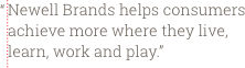
Hanging "quotation" marks is preferrable so copy aligns flushed left, but not necessary.
Bullets and text are the same font size and align flush left in the text column. There is one space between the bullet and the first character. Indent second line of copy to align with first word following a bullet. No return before a bulleted list unless it begins a separate set of information as a paragraph would. (Bullet and text sample shown).

Newell Brands uses the AP standard for serial commas.
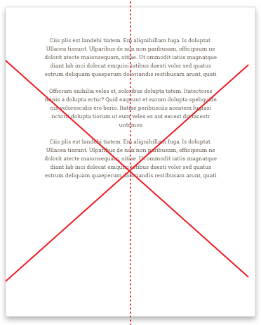
A clear and defined typographic style is another important aspect of building our brand. Roboto and/or Roboto Slab headlines and body copy should always appear flush left, ragged right in all visual communications. Never justify or center type.
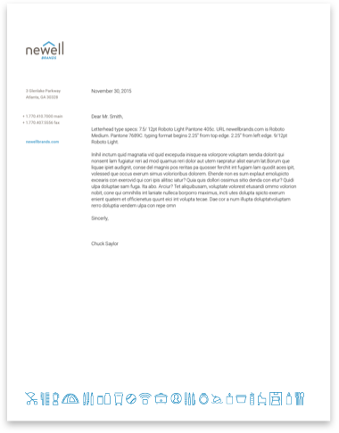
left align type on letterhead
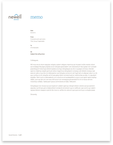
left align type on memo

left align type in PowerPoint
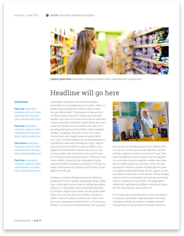
left align type in newsletters
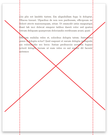
NO justified type
NO centered type